5 Dumb Ideas to Avoid in UI Design in 2026
UI design in 2026 is less forgiving than it used to be. Users spot friction fast, and a pretty screen won’t save a confusing one.
5 Dumb Ideas to Avoid in UI Design in 2026
UI design in 2026 is less forgiving than it used to be. Users spot friction fast, and a pretty screen won’t save a confusing one. At Matracode, we see the same mistake over and over: teams focus on how a UI looks before they solve how it works.
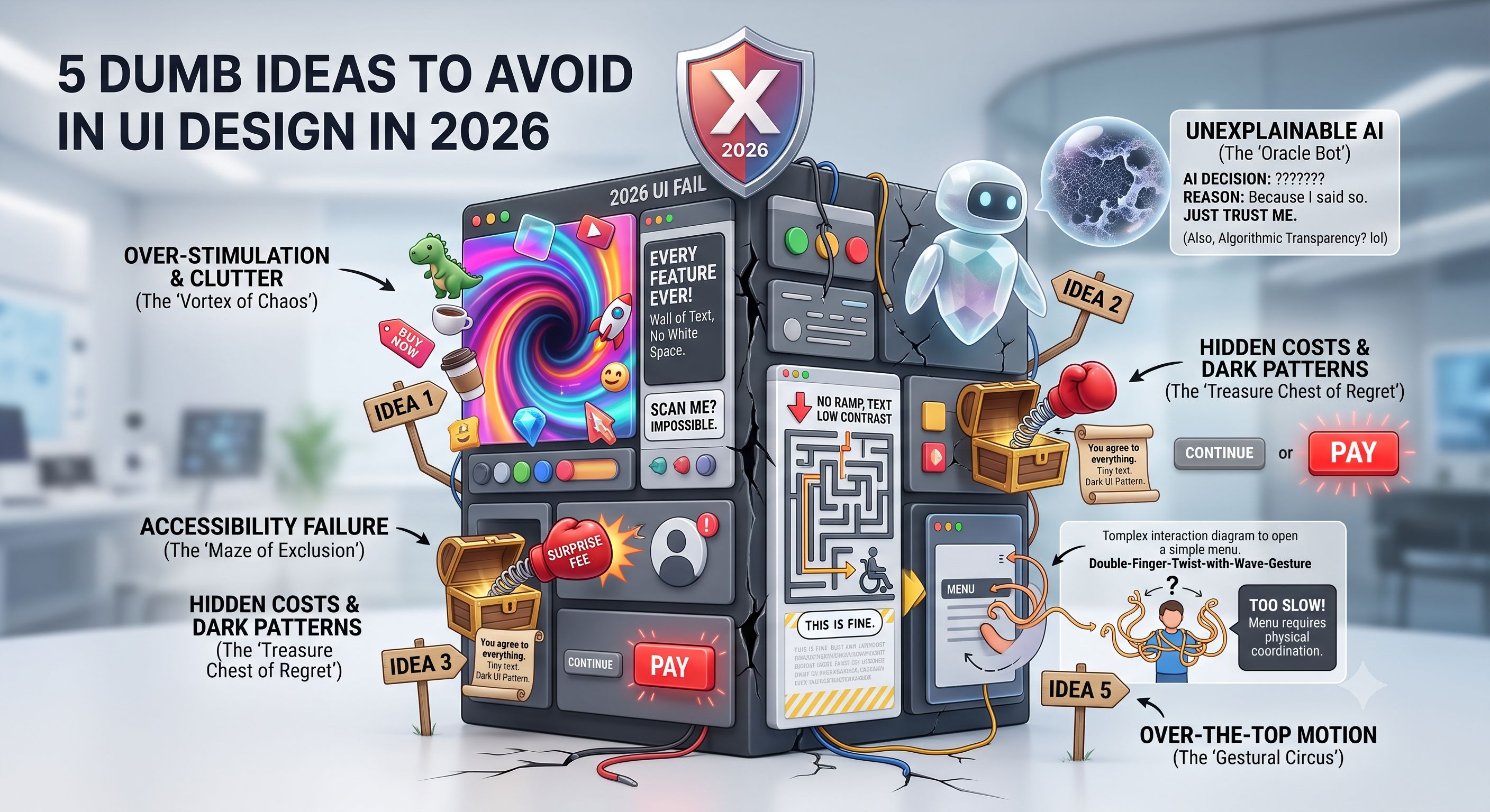
1. Designing for looks before clarity
This is still the biggest mistake: making a screen look impressive before making it easy to use. Glassmorphism, heavy shadows, motion, and trendy layouts can all be fine, but only if users can still understand what to do in a few seconds. A UI that needs explanation is already losing.
At Matracode, we treat clarity as the baseline, not a bonus. If the visual polish makes the flow harder to scan, tap, or trust, we strip it back and fix the structure first.
2. Filling every screen with too much stuff
A crowded interface looks productive, but it usually just creates noise. Too many buttons, too many CTAs, too many badges, and too many competing colors make users slow down and second-guess themselves. That slows down conversions and makes the product feel heavier than it is.
Our approach at Matracode is simple: one screen, one main action, one clear hierarchy. Everything else has to earn its place.
3. Ignoring accessibility until the end
Accessibility is not a cleanup task. If your contrast is weak, text is small, spacing is tight, or keyboard and screen-reader support is an afterthought, you’re building a product that excludes people and creates avoidable risk. In 2026, that’s not a small miss. It’s a basic failure.
Matracode builds with accessibility in mind from the start, because readable text, clear states, and easy tap targets help everyone, not just users with specific needs. Better accessibility usually means better usability.
4. Copying trends that don’t fit the product
Just because a pattern is popular doesn’t mean it belongs in your app. Trend-chasing often leads to mystery icons, overdone animations, unclear navigation, and interfaces that feel modern but don’t actually help people move through the product. Users care more about getting things done than seeing the latest visual trick.
That’s where mature design matters. At Matracode, we don’t copy trends for style points. We choose patterns that fit the user, the product, and the actual business goal.
5. Designing only the happy path
A lot of interfaces look fine when everything works. The real test is what happens when things break, load slowly, fail validation, or return nothing. Empty states, error states, loading states, and edge cases are part of the product, not extra work.
This is where mature UI work shows up. Matracode designs for the messy parts too, so the product still feels clear and usable when reality gets in the way.
How Matracode works
When a client comes to us with a UI that looks good but feels off, we don’t start by polishing pixels. We start with the flow, the hierarchy, the states, and the friction points. That usually means simplifying the main action, fixing consistency, designing edge states, and removing anything that looks clever but slows people down.
That’s what mature design solutions look like in practice: fewer guesses, fewer dead ends, and fewer UI decisions that create support tickets later.
If a screen looks nice but confuses people, Matracode treats that as a product problem, not a styling issue. Our job is to make the interface feel calm, clear, and hard to misuse.